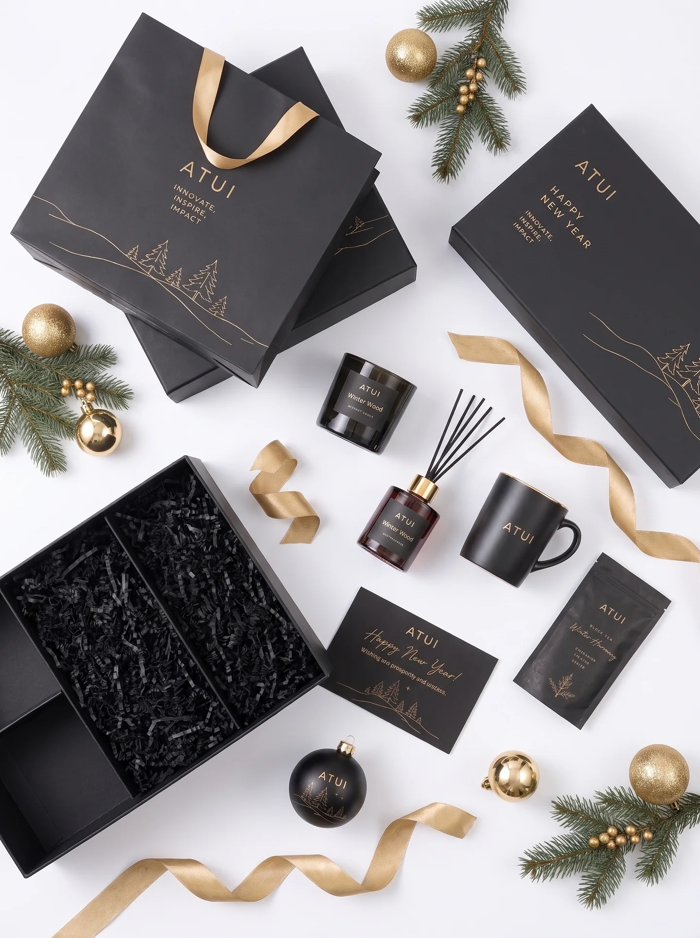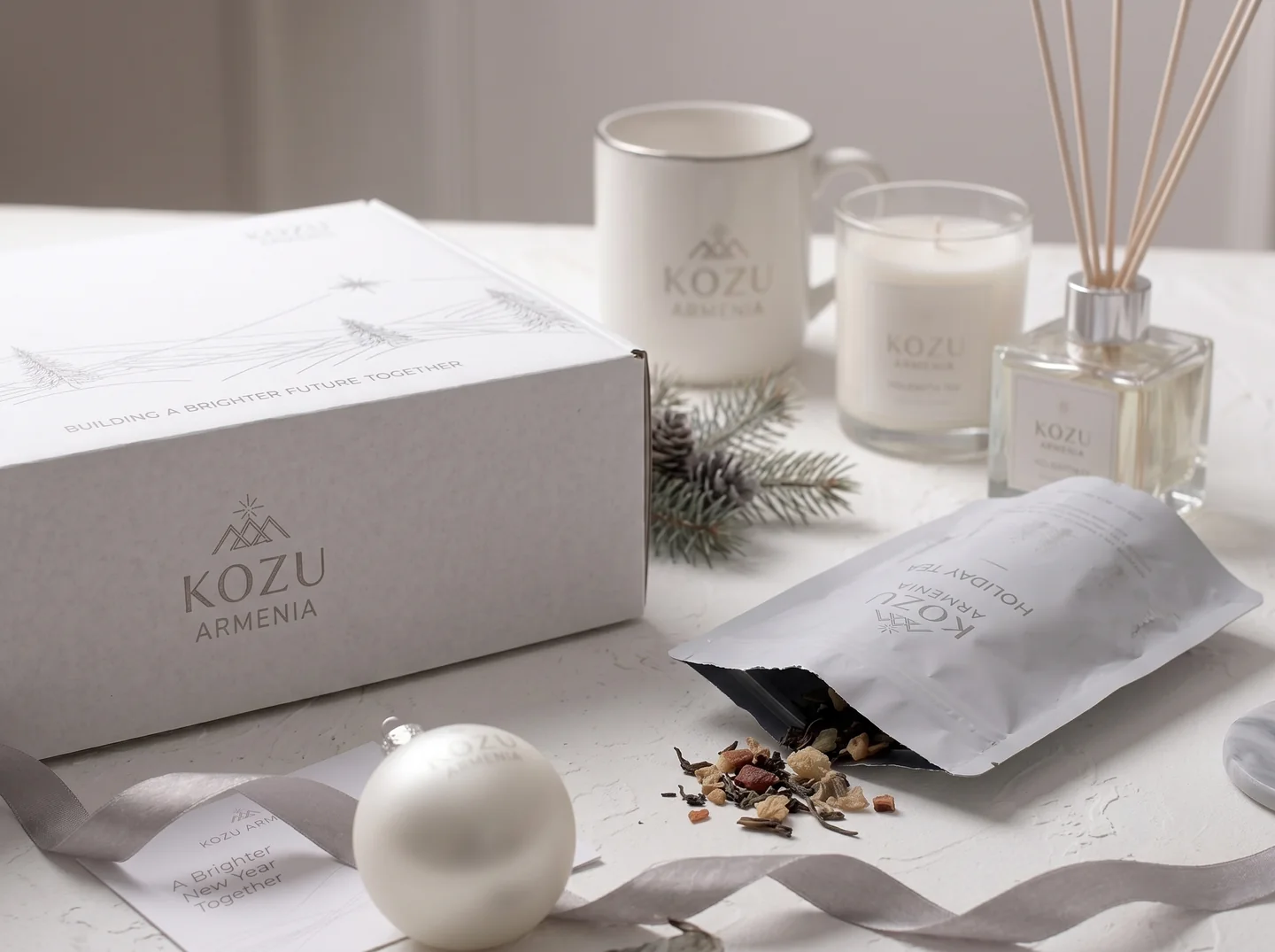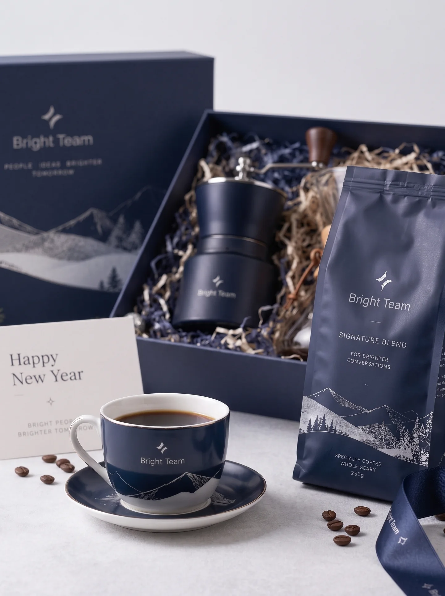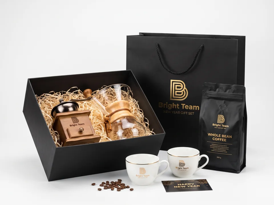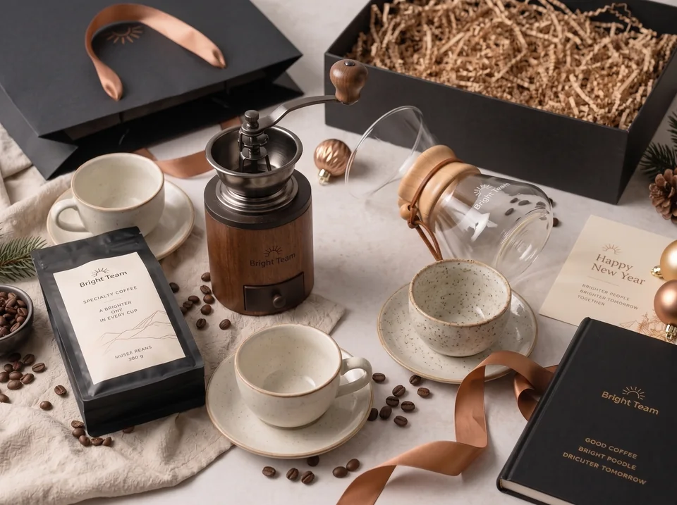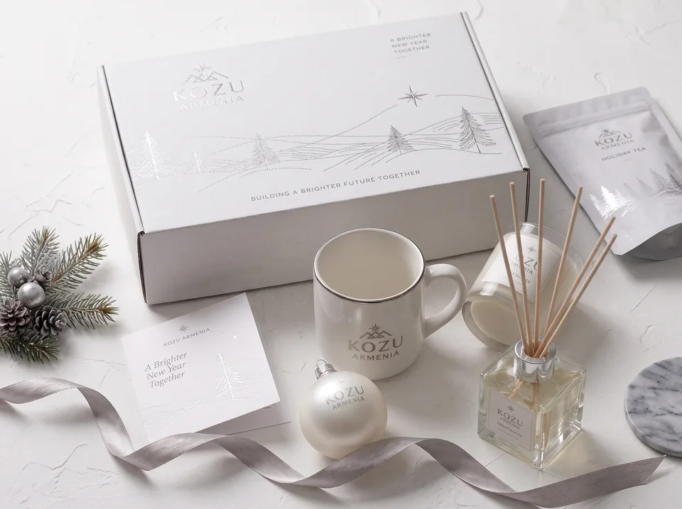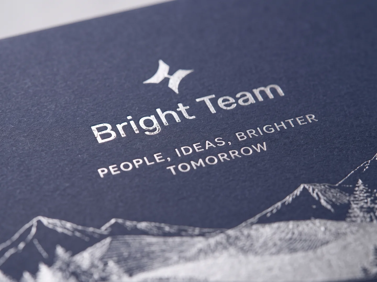
A branded gift set needs a visual system before it needs a list of printing processes. Decide what the recipient should notice on the box, what belongs on the object, and where a personal message will appear. The new POP GIFT gallery offers light winter linework, black-and-gold contrast and a navy mountain theme. Here is how to translate those references into an actionable brief for custom business gifts.
Give each surface a role
The box can introduce a full illustration. A cup can carry a small recognisable mark. The greeting card can speak directly to the recipient. On tea or coffee packaging, the brand area must coexist with product information. Repeating one large logo everywhere can make the objects compete rather than feel like a collection.
In the navy Bright Team concept, the mountain drawing connects several surfaces. In the white KOZU ARMENIA series, a restrained palette and fine lines do the work. ATUI relies on contrast. These observations describe the supplied visuals; they do not confirm the manufacturing process behind any image. The production brief for a new order must identify its own materials and approved techniques.
Specify box decoration precisely
For a full-colour illustration, discuss digital or offset printing against the construction, material and quantity. A metallic accent is a separate choice. Foil decoration, a metallic-coloured printed effect and raised detail are not interchangeable instructions. Fine artwork on textured paper should be evaluated at actual size, particularly where small letters or closely spaced lines matter.
If names or greeting messages vary, separate the permanent artwork from variable content. A card, sleeve or label can hold that personalisation without complicating the entire box. Review embossing and foil-related options and offset printing as starting points, then agree the process for the chosen substrate. A photograph’s metallic-looking finish cannot serve as a production specification.
Match decoration to cups, glass and wooden parts
Ceramic decoration may involve a suitable decal, direct print or another compatible process. Sublimation requires an appropriate coating; it is not suitable simply because an object is a mug. Decide where the design sits relative to the handle. If a selected item has genuine metallic trim, request its specific use and care instructions rather than judging the trim from its colour.
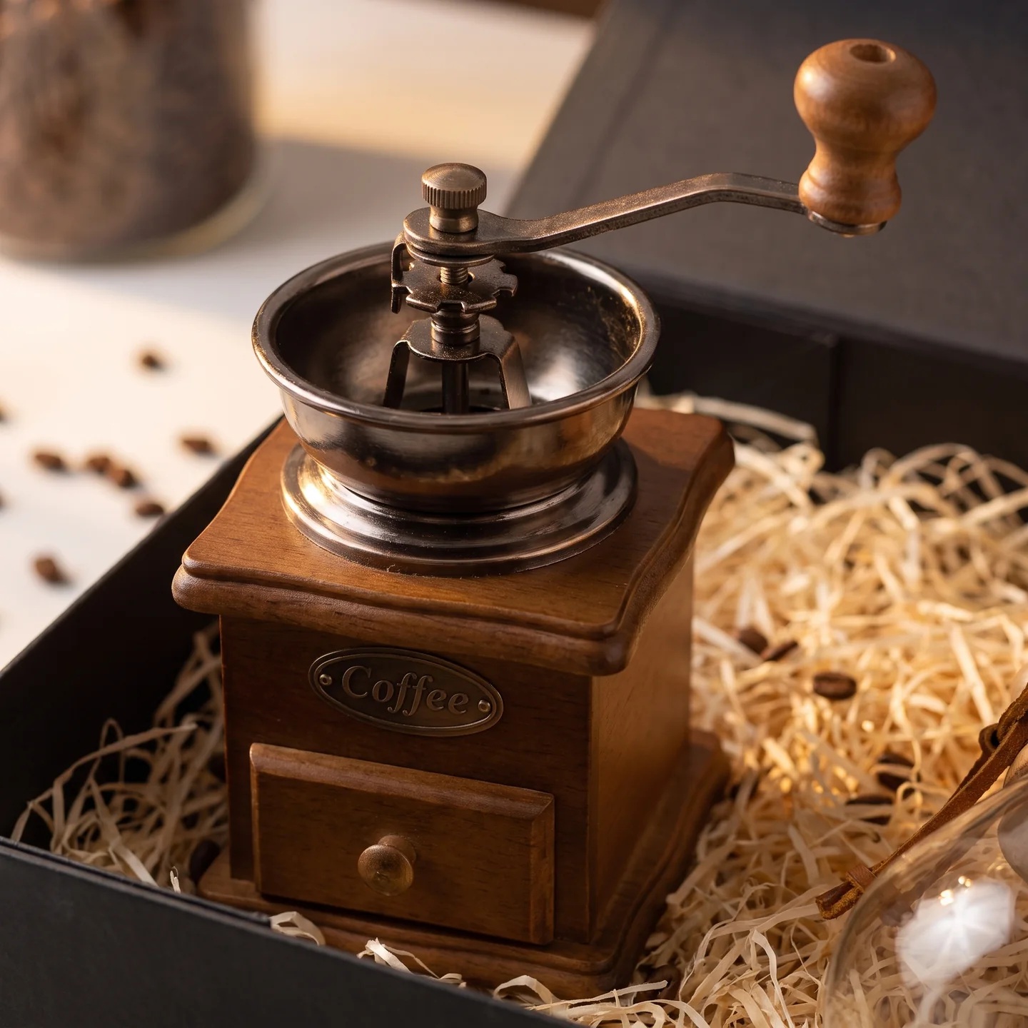
A wooden grinder component may be considered for engraving, with natural variation taken into account. Glass and coated components need their own suitability checks. Do not promise the same result on every material, or washing durability without confirming the selected product and process. Compare the site’s engraving, ceramic decal and UV printing directions when discussing the brief.
| Surface | Artwork decision | Physical approval |
|---|---|---|
| Box | Dieline, folds and separate effect layers | Alignment, readability and closure |
| Cup | Mark size and position beside the handle | Contrast, print edges and care guidance |
| Glass vessel | Decoration area allowed by the shape | Access and finished appearance |
| Wooden component | Simplified mark at actual size | Tone, grain and positioning |
| Beverage label | Brand area alongside producer information | Readability and secure application |
Approve an assembled reference sample
A digital mock-up is useful for positioning, but it cannot communicate all surface effects. Agree size, contrast, placement and acceptable differences on a physical reference. Compare gold-coloured details across paper, ceramic and ribbon together. Approve the full set, including its insert, greeting card and closed packaging, so that separate attractive objects do not become an awkward final arrangement.
Provide a vector logo, brand colour references, approved illustration and final texts. Check thin lines and small type at 1:1 scale. For multilingual cards, confirm the real fonts and Armenian characters in the production files. Keep the approved PDF and working artwork at the same revision; a late wording change should not quietly bypass approval.
Use examples and technical references responsibly
The published decorated New Year ornaments and Royal Ark gift set offer additional decoration examples. They do not establish how the new concept photographs were made. Start product selection in corporate sets and use the order brief to define all deliverables.
For production questions, useful primary references include Trotec’s material suitability guidance, Roland DG’s UV adhesion checks and KURZ’s packaging finishing overview. Use them to frame questions, then confirm the selected gift item through its documentation and sample. They are not evidence of the processes used in the supplied visuals.